
 By Janet Franklin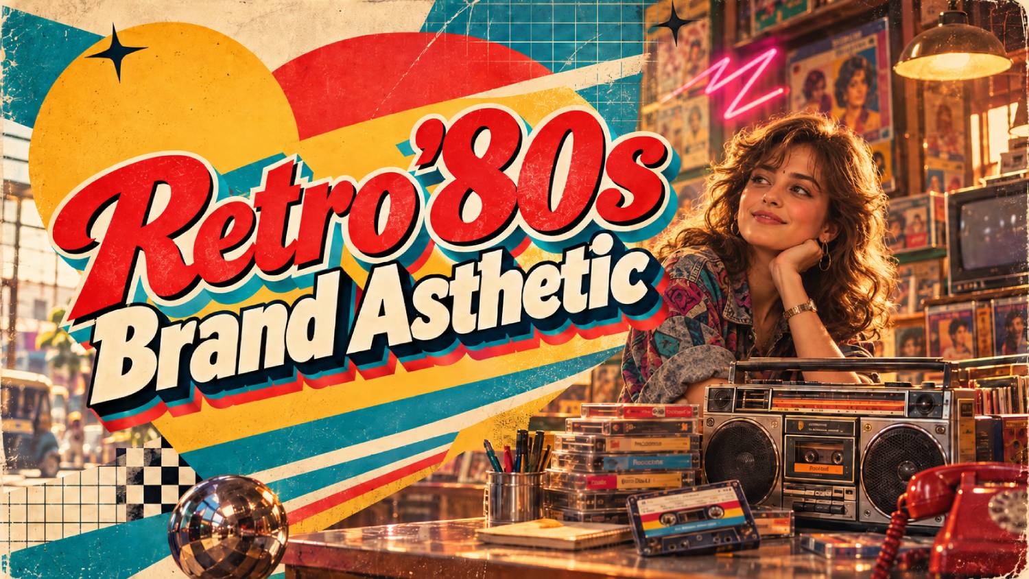
A retro ’80s look can make a brand feel instantly bold, playful and memorable. Neon colors, chrome type, grids and film grain cut through crowded feeds in a way that clean, minimal design often cannot.
The challenge for marketers is consistency. Generating one striking retro image is easy. Producing dozens of social posts, ads and thumbnails that all look like they belong to the same brand is much harder, especially with AI tools that interpret every prompt slightly differently.
This guide shows you how to build a retro brand style kit, write a master style prompt you can reuse, and apply it with 20 ready-to-use 1980s AI prompts for social posts, ads, thumbnails and brand assets. Replace the bracketed placeholders with your own brand details.
Key Takeaways
▸ AI prompts can recreate distinctive 1980s branding through neon palettes, chrome effects, geometric patterns, gradients, grids, and retro typography.
▸ Strong prompts should define the colour palette, lighting, graphic style, composition, texture, and intended brand mood.
▸ The aesthetic can work across logos, packaging, posters, social graphics, advertisements, product mockups, and campaign visuals.
▸ Combining authentic ’80s references with cleaner modern layouts can make retro branding feel nostalgic without looking dated.
▸ Consistency across prompts is important when creating a complete visual identity rather than individual images.
Why Consistency Matters, and How to Build a Retro Style Kit
A visual identity works through repetition. When people see the same colors, type and textures across channels, they start to recognize your brand before they read your name. A retro theme only helps if it is applied consistently. Random neon images look like a trend, not a brand.
Before you write a single prompt, define a simple style kit. It keeps AI output, designers and agencies aligned.
| Element | What to decide | Example choice |
|---|---|---|
| Era flavor | Which ’80s style fits your brand | Neon synthwave, pastel coastal, arcade pixel or VHS grunge |
| Color palette | Three to five colors with hex codes | Deep purple #1A0B2E, magenta #FF2E97, cyan #00E5FF |
| Typography | Headline and body fonts | Chrome or neon script for headlines, clean sans serif for body text |
| Signature motifs | Two or three recurring visual elements | Perspective grid, striped sun, cassette icon |
| Texture | How finished images should feel | Light film grain and soft scan lines |
| Photography style | How people and products appear | Product lit with magenta and cyan rim light on a dark background |
| Logo usage | How your current logo fits the theme | Original logo in white, placed in the bottom corner |
| Don’ts | What to avoid | No real ’80s brand references, no clutter, no illegible text |
Keep the theme a layer on top of your existing brand, not a replacement. Your logo, voice and core colors should still be recognizable.
The Master Style Prompt: Your Consistency Shortcut
The most important prompt in this guide is not on the list of 20. It is your master style prompt, a short block of text that describes your retro look and gets added to every request.
Here is a template to adapt:
[BRAND] retro style: 1980s synthwave-inspired brand visual. Color palette of deep purple (#1A0B2E), hot magenta (#FF2E97) and electric cyan (#00E5FF), with a warm yellow-to-orange accent. Recurring motifs: a glowing perspective grid and a striped sunset sun. Clean, modern composition with generous negative space. Subtle film grain and soft neon glow. No real brands, logos or famous people other than the [BRAND] logo when provided. Any text must be short, bold and legible.
How to use it
- Save it somewhere easy to copy, such as a shared document or your AI tool’s custom instructions or saved prompts, if available.
- Paste it at the start of every prompt, then add the specific request.
- Upload reference images of approved designs when your tool supports it, and ask it to match their style.
- Update it as you learn. If a word consistently causes problems, change it in the master prompt so every future image improves.
In the prompts below, [STYLE] means “paste your master style prompt here.”
❉ Social Post Prompts
1. Product hero post
[STYLE] Create a square 1:1 social post featuring [PRODUCT] centered on a reflective dark surface, lit with magenta and cyan rim light. A glowing grid floor recedes behind it toward a striped sun. Leave space at the top for a short headline.
2. Announcement post
[STYLE] Create a 4:5 portrait social graphic announcing “[ANNOUNCEMENT].” Use large chrome headline lettering with neon outline, placed over a gradient purple sky with a subtle grid at the bottom. Keep the layout simple and readable on a phone.
3. Quote or tip card
[STYLE] Create a square social card designed to hold a short quote or tip. Show a retro computer monitor with a glowing screen area left blank for text, set against a neon grid background. Clean composition, no text in the image.
4. Team spotlight background
[STYLE] Create a 4:5 background for a team spotlight post. A soft neon frame shaped like a retro TV screen sits in the center, empty so a team photo can be placed inside. Add a striped sun and faint grid behind it.
5. Event or webinar teaser
[STYLE] Create a 9:16 vertical story graphic for an event called “[EVENT NAME].” Include a retro cassette tape illustration in the center with the event name in bold neon type, a glowing grid floor, and empty space at the bottom for date and time.
6. Carousel cover slide
[STYLE] Create a square carousel cover slide titled “[TOPIC].” Show a stylized arcade-style title screen with a glowing border and a small blinking-style arrow pointing right to encourage swiping. Bold, legible headline, minimal extra elements.
❉ Ad Creative Prompts
Ads need a clear focal point and space for your message. Always check platform guidelines for text, image size and claims before running them.
1. Sale or offer ad
[STYLE] Create a 1:1 ad image for a sale. A large neon price-tag shape glows in the center with space for “[OFFER].” Surround it with a striped sun and grid floor. High contrast, uncluttered, with the main element readable at small sizes.
2. Before-and-after style ad
[STYLE] Create a 16:9 ad split into two halves. The left side shows a dull, gray everyday scene. The right side shows the same scene transformed with neon color, a glowing grid and a striped sun, representing [BENEFIT]. Clear dividing line down the middle.
3. Retro VHS cover ad
[STYLE] Create a 4:5 ad styled like an original 1980s VHS tape cover for [PRODUCT]. Bold title area at the top, product shown heroically in the center with dramatic lighting, and a worn cover texture. Use only [BRAND] and invented names.
4. Retro tech showcase
[STYLE] Create a 1:1 ad showing [PRODUCT] displayed on a retro computer screen or vintage handheld-style device, glowing in neon light. Background of a dark room with a faint grid. Modern product, retro framing.
5. Lifestyle ad with people
[STYLE] Create a 4:5 lifestyle ad showing a group of diverse friends in modern clothing with subtle ’80s touches, laughing under neon lights in a retro-style diner while using [PRODUCT]. Warm, candid feel with film grain. No real brand logos except [BRAND].
6. Arcade game ad
[STYLE] Create a 16:9 ad styled as an arcade game screen. [PRODUCT] appears as the hero object, with a pixel-art score counter in the corner and the call to action “[CTA]” in a retro game font. Original design, no existing game characters.
❉ Thumbnail and Banner Prompts
Thumbnails are viewed at tiny sizes, so they need bold shapes, strong contrast and very little text.
1. Video thumbnail background
[STYLE] Create a 16:9 video thumbnail background with a bright striped sun on the right side and a glowing grid floor. Leave the left half clear and slightly darker for a face cutout and two or three bold words. Maximum contrast and saturation.
2. Tutorial or how-to thumbnail
[STYLE] Create a 16:9 thumbnail showing an oversized retro cursor clicking a glowing neon button, with sparks of light around it. Simple, punchy composition that reads clearly at small sizes. Leave room for a short title.
3. Podcast or series cover
[STYLE] Create a square 1:1 podcast cover for “[SHOW NAME].” Feature a vintage microphone glowing in neon outline in front of a striped sun, with the show name in bold chrome lettering. Clean and legible as a small app icon.
4. Website hero banner
[STYLE] Create a wide 21:9 website hero banner. A sweeping neon landscape with a grid floor, wireframe mountains and a striped sun on the right. Keep the left 40 percent dark and uncluttered for headline text and a button. No text in the image.
5. Email header
[STYLE] Create a 3:1 email header banner with a soft neon grid, a small striped sun and a cassette tape icon. Space in the center for a short headline. Keep the file visually simple so it loads cleanly and works in dark and light email modes.
❉ Brand Asset Prompts
These prompts create reusable building blocks that make the rest of your content faster and more consistent.
1. Background texture set
[STYLE] Create a set of four matching 1:1 background textures for social media: a plain gradient sky, a grid floor only, a striped sun only, and a subtle scan-line pattern. Same palette and lighting in all four. No text or objects.
2. Icon and sticker pack
[STYLE] Create a sheet of eight matching retro icons on a dark background: cassette tape, boombox, joystick, floppy disk, star, lightning bolt, palm tree and striped sun. Consistent neon line style and thickness, evenly spaced, suitable for stickers and highlight covers.
3. Mood board
[STYLE] Create a 16:9 brand mood board collage for [BRAND]’s retro campaign. Include color swatches, sample chrome headline lettering, a grid landscape, a product shot of [PRODUCT] in neon lighting, and texture samples. Clean grid layout with labeled sections.
Share the mood board with your team or agency as a quick visual reference alongside your style kit.
Keeping Your Retro Brand Consistent, Compliant and Effective
Consistency
- Add your real logo and text afterward. AI tools often distort logos and lettering. Place official logos and final copy in a design tool such as Canva, Figma or Adobe Express.
- Build templates. Turn your best AI images into reusable templates with fixed positions for logos, headlines and calls to action.
- Review as a set. Before publishing, view new images side by side with existing ones. If one looks out of place, regenerate or adjust it.
- Limit variations. Stick to one era flavor per campaign rather than mixing synthwave, pastel and pixel art.
Compliance
- Avoid real brands and characters. Do not reference other companies’ logos, products or famous ’80s characters.
- Use real people carefully. Only feature employees or customers with permission, and avoid generating likenesses of celebrities.
- Disclose when appropriate. Some platforms and regions have rules about labeling AI-generated content in ads. Check current requirements before launching.
- Check accessibility. Neon on dark backgrounds can look striking but may be hard to read. Make sure text has enough contrast and size.
Effectiveness
- Test against your usual creative. Run retro and standard versions side by side to see which performs better for your audience.
- Track the right metrics. Watch engagement, click-through rate, conversions and brand recall rather than likes alone.
- Know when to retire it. A retro theme works best as a campaign or seasonal look. Refresh it before it starts to feel stale.
Frequently Asked Questions
What is a retro brand aesthetic?
A retro brand aesthetic uses design elements from a past era, such as colors, typography, textures and motifs, to give a brand a nostalgic, distinctive personality. The ’80s version typically features neon colors, chrome type, grids and film grain.
How do I keep AI-generated images consistent?
Create a style kit and a master style prompt that you paste into every request. Upload approved reference images when possible, add logos and text in a design tool afterward, and review new images alongside existing ones.
Will a retro look suit every brand?
Not always. It works best for brands with a playful, creative or nostalgic angle, or for specific campaigns and seasonal content. Test it with your audience before committing broadly.
Can I use AI-generated images in paid ads?
Generally yes, but check the AI tool’s terms of use and each ad platform’s policies, including any requirements to label AI-generated content.
Should I change my logo to match a retro theme?
Usually not permanently. Keep your core logo recognizable and use the retro style around it. Some brands create a temporary retro logo variant for limited campaigns.
Final Thoughts: Make Retro Work Like a System
A retro ’80s aesthetic can give your brand instant personality, but it only builds recognition when it is applied consistently. Define your style kit, write a master style prompt, use templates and review your creative as a set. Then the 20 1980s AI prompts above become a repeatable system rather than a one-off experiment.
Striking visuals win attention, but brands grow when that attention turns into discovery and trust. At Megrisoft, we help businesses connect creative campaigns with SEO, content strategy and AI search optimization. If you want your brand to be both memorable and easy to find, get in touch with our team.